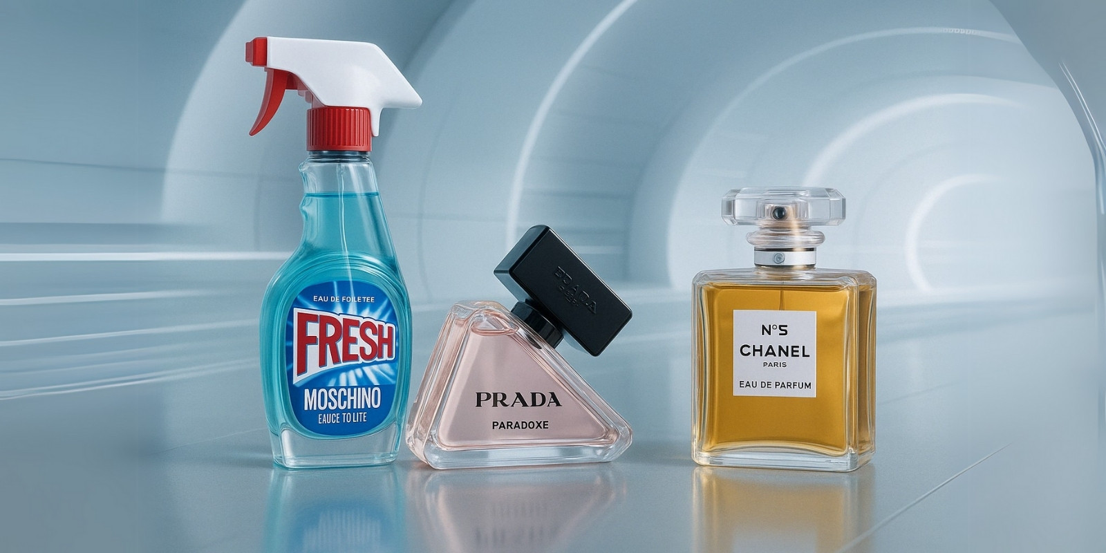
I would like to be the kind of person who doesn’t judge a book by its cover. Close my eyes and blind test fragrances by their scent alone, but alas! I am only human. If the perfumers didn’t want their concoctions judged by appearance, they wouldn’t package them in stunning bottles that makes me beeline to the store shelf. Just as we express ourselves through our fashion, makeup, jewelry, and…well, perfumes– perfumes hint on their character through their colour and bottle design before we can catch a whiff of their character.
Bottles speak of the time in which they were made, of the people who would love it most, tell you what a spritz would have you feel. The appearance is what makes the first impression, but it can also be a deciding factor in the present age of curating specific aesthetics for yourself. If your favorite fragrance wows you but doesn’t fit the decor of your room, you might pause before making a purchase. Or hide it away so it doesn’t clash with your aesthetic.
Minimalist Bottles
The minimalist aesthetic is one for the no nonsense type who wants to be defined by their character rather than external appearances. It defies materialism and settles for the quiet luxury characteristic of the current era. Rising concerns over the environmental impact of our consumption patterns also contributes to the popularity of this style. Minimalism is not just in the colors, shapes, and textures but also in ecological impact. Bottles in this style are less likely to waste material on elements not wholly necessary.Minimalist isn’t synonymous with plain or boring– some very iconic brands prove this with their stand-out bottles.
Chanel No.5
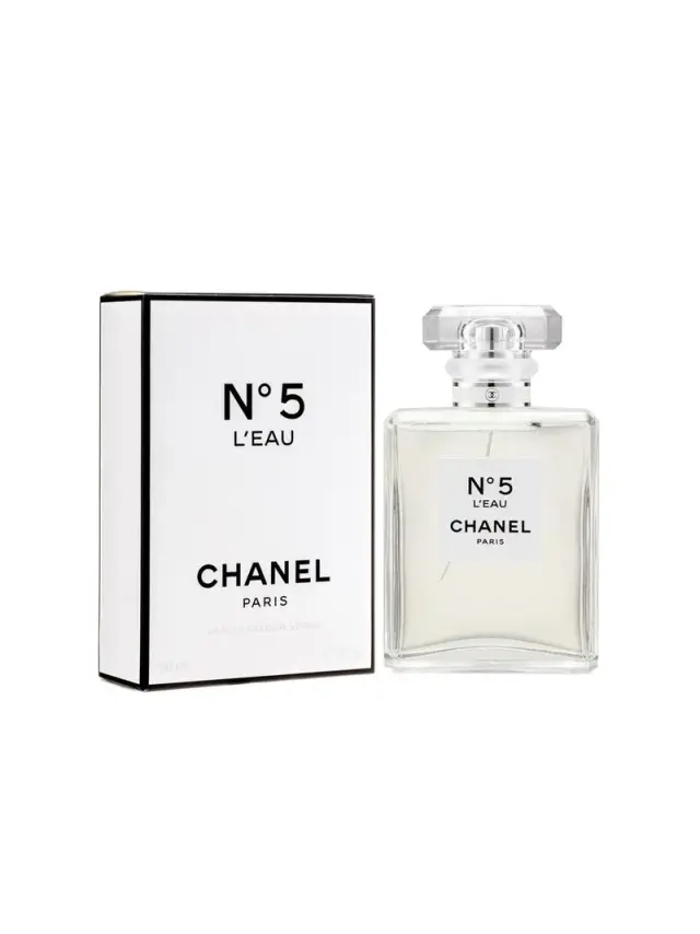
It’s hard to start anywhere except the instantly recognizable Chanel No.5 bottle. A timeless classic women have long associated with sophistication and coming into womanhood. Upon its release in 1921, the simple geometric design was audacious in its simplicity amongst the grander bottles of its time. One hundred years later, minimalism is the aesthetic, testimony to Coco Chanel’s enduring vision in crafting the product.
Chanel No.5 derives its name from simply being No.5 of the 10 fragrances perfumer Ernest Beaux concocted as contenders to be the company’s first fragrance. The clean design of this bottle is indicative of the clean fragrance within, an homage to Coco Chanel’s childhood growing up around the soapy fresh scents surrounding her mother, a laundrywoman. Though an unquestionable classic now, it was quite the daring rule breaker in its advent– a marriage of upper-class florals and musks characteristic of lower classes. Some attribute the sleek design to whiskey flasks and others attribute it to the clean clinical design of laboratory vials, both a defiance of the conception of femininity in the roaring 20s.
The bottle has changed very little over the century. It’s easy to agree with Chanel’s official history of the fragrance as one that resists the whims of fashion and the passage of time.
Prada Paradoxe
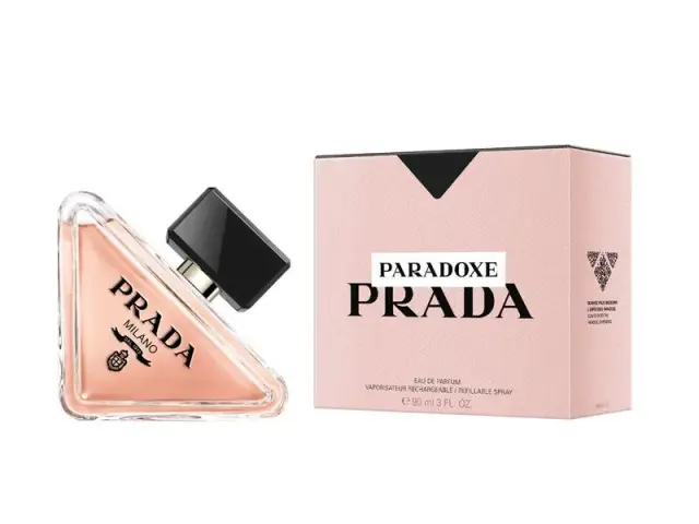
The shape comes from Prada’s iconic isosceles triangle logo, adopted by founder Mario Prada as a mark of quality craftsmanship. Polygons can be built with an infinite number of sides, but you need three sides– three angles– to begin with. Triangles are solid, dependable, resistant to the forces applied to it– there is a reason the shape is prevalent in building the world around us. They can be trusted to bear the weight placed on them without crumbling under the pressure.
The way I see it, choosing a triangle for a logo indicates that the brand is where it all begins, that it is solid, trustworthy, no frills attached. It is strong, dependable, and undistorted by external forces. Prada’s inverted triangle intrigues in a way an upright one wouldn’t. I can see where Creative Director Coralie Salem comes from in her description of the flacon’s design as minimalist yet radical.
The light pink of the perfume contradicts the rigidity of the triangle with an aura of softness also reflected in its rounded edges. It subverts the commonly accepted notion that something strong and rigid must contain rough and aggressive qualities. It’s designed to embody the paradox that is the modern Prada woman– sweet and tough, determined with delicacy. The fragrance within is as reliable as the bottle suggests- can be worn throughout the year, lasts all day and accompanies you to the night. It opens with the excitement of sparkly fresh neroli and uplifting citrus, later moving to a paradoxical sweetness and warmth of vanilla. Just the right energy as the bottle.
Inspired By…
These are flacons inspired by objects you wouldn’t expect to see on a perfume store shelf. In a sea of basic geometrical shapes, they aim to catch your attention, invisible threads luring you in so the fragrance can make its impression. Some can be criticized as gimmicky or tacky, but they make you look. Invaluable in our attention economy where even outrage can help sell.
Moschino Fresh
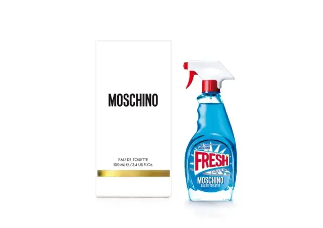
Now that’s a bottle that doesn’t take itself seriously. It makes one do a double take– what’s a window cleaner doing next to a perfect bottle of Guerl–ahh it’s a Moschino Fresh!
If minimalist bottles choose them to prove they don’t need overstated packaging to speak for them, this bottle does the opposite. It makes an audacious statement– the fragrance is too irresistible that even strange off-putting packaging won’t deter a purchase. The fragrance is FRESH, true to what the packaging more than just suggests. It opens with energetic citrus and florals and when they fade, make way to fruity sweetness and the powdery elements of the florals.
It’s nothing surprising from a house that habitually defies the definition of luxury set by longstanding fashion houses. Some might find it abhorrent that a luxury brand would be so brazen as to sell a fragrance in what looked like a cleaning supply bottle. Some might be amused by this boldness, encouraging a purchase. One fan of the bottle says ‘I don’t even wear perfume, I just want a tiny cleaner bottle’. Tacky, cute, insulting, gimmicky– whatever you may think of it, you can’t deny that Moschino Fresh occupied your thoughts.
Paris Hilton Love Rush
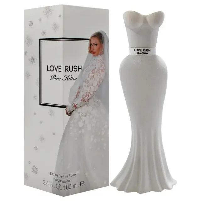
Paris Hilton’s Love Rush comes in a bottle much like the other perfumes of her Rush collection. A sweetheart neckline bodice makes the bottle cap where it meets the dress’ belt that contains the name of the fragrance. It flows from the belt into a curvy skirt that holds Love Rush. Enthusiasts might find this bottle design to be a cute and modern version of the more daring Schiaparelli Zut.
The lactonic fragrance evokes a ‘second skin’ feeling and the creamy white bottle represents this well. If you think the bottle is reminiscent of a wedding dress in its soft white, devoid of the childlike glitters found in the predecessors of this collection, you would be right. The sweet and romantic fragrance was developed by Parisian perfumer Clement Gavarry especially for Paris’ wedding day and released for fans on her one-year anniversary. It’s the unveiling of a fresh bouquet of white flowers. It’s sweet–not obnoxiously so but with the quiet elegance of a wedding day. This flacon will have a special place on your vanity, beginning your day with a reminder of your special day. It can travel with you– quiet, delicate, and with all the softness of marital bliss.


